 Click image to view gallery
The Key to Effective Data Visualization is COLOR
Color plays a crucial role in data visualization, transforming bland data into a compelling story.
 Click image to view gallery
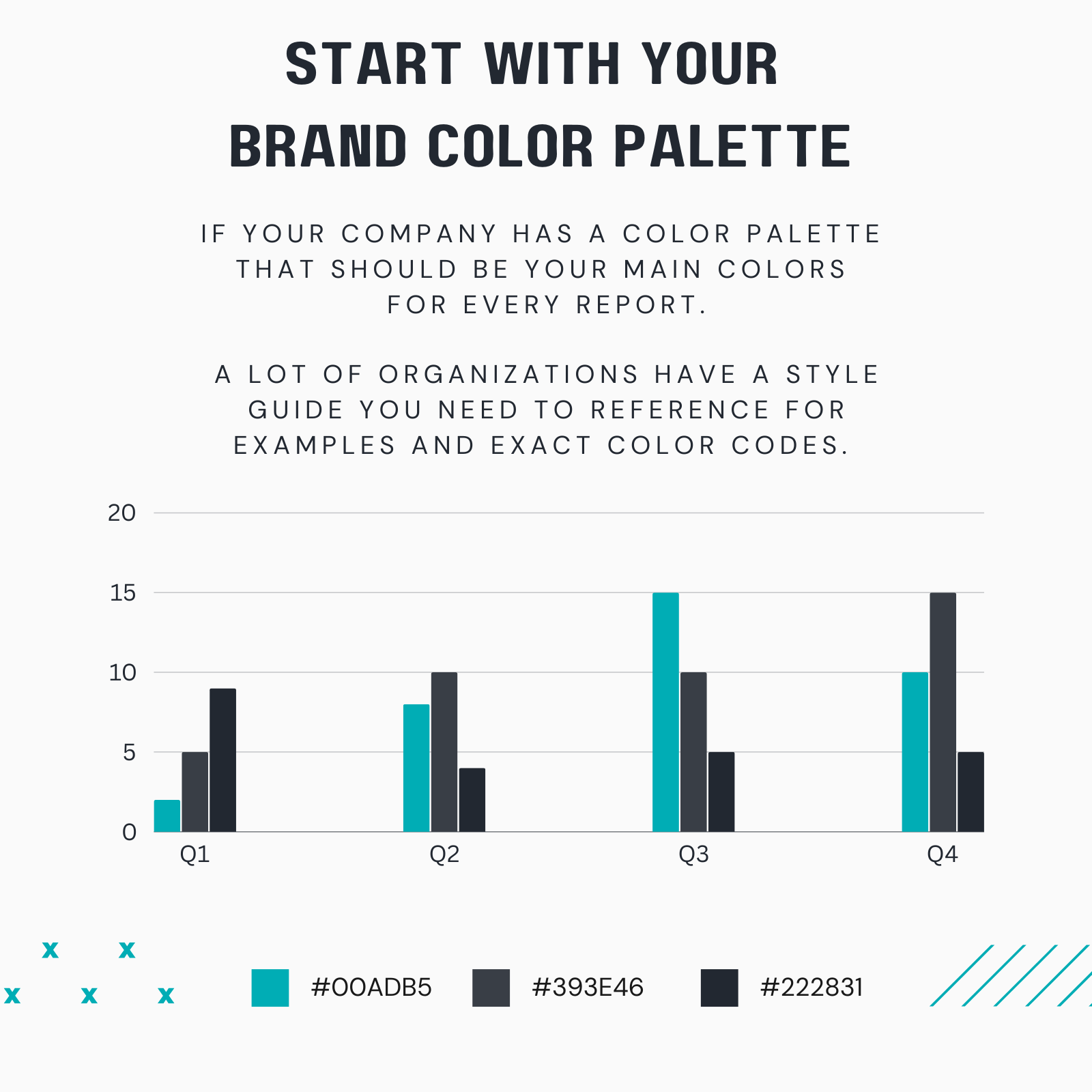
Refer to your organization’s style guide for specific color codes and examples.
Good vs. Bad Color Habits
 Click image to view gallery
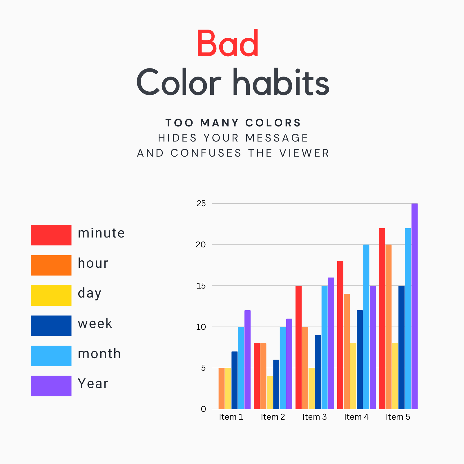
Bad Color Habits
Using too many colors can obscure your message and make your report look cluttered. This can overwhelm the viewer and dilute the impact of your key insights.
 Click image to view gallery
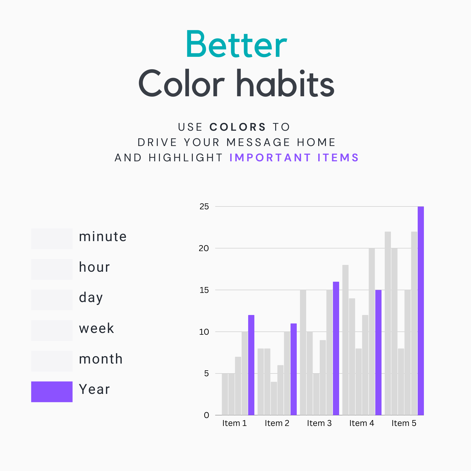
Better Color Habits
Opt for a streamlined color palette that enhances your message. Use colors strategically to highlight important data points and guide the viewer’s attention to critical information.
Good vs. Bad Contrast
 Click image to view gallery
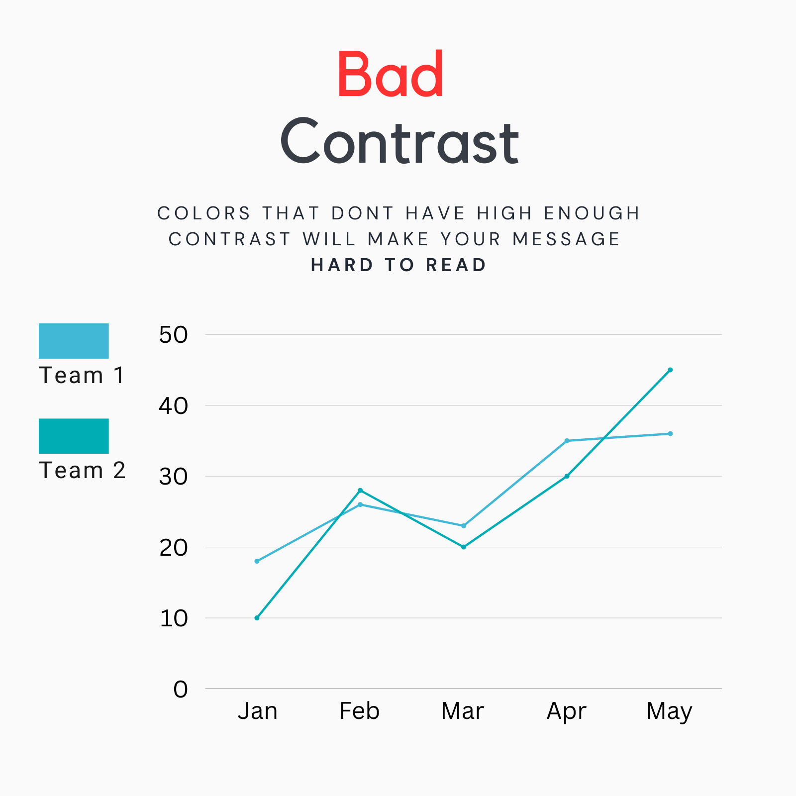
Bad Contrast
Colors with insufficient contrast can make text and data hard to read, especially for individuals with visual impairments or color blindness.
 Click image to view gallery
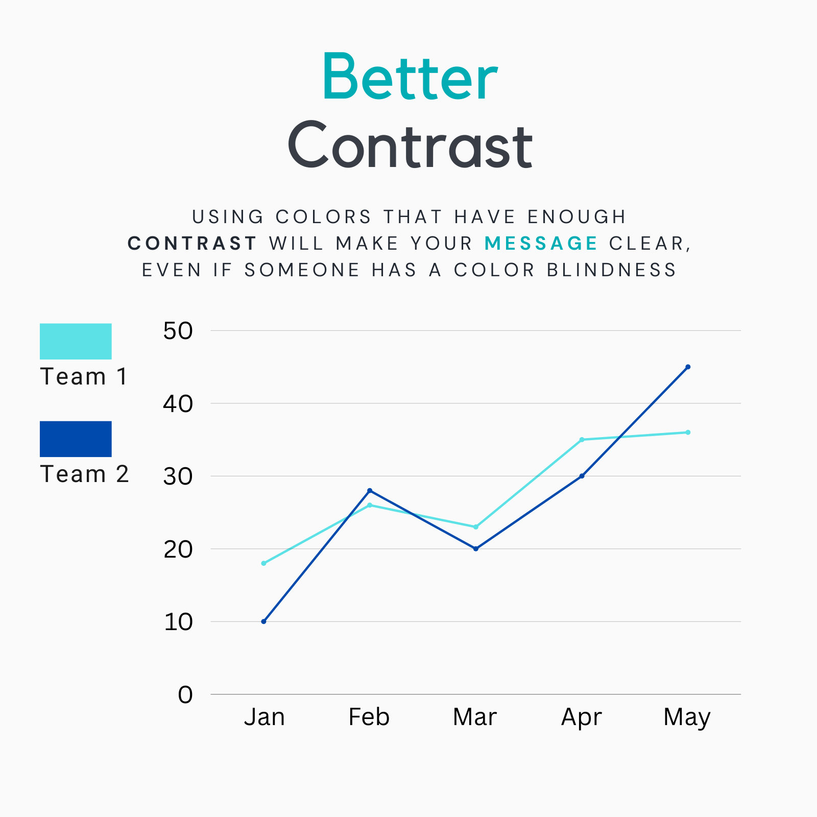
Better Contrast
Ensure that there is enough contrast between text and background colors. This improves readability and accessibility, making your report more inclusive to all viewers.
How to Use Black and WHITE
 Click image to view gallery
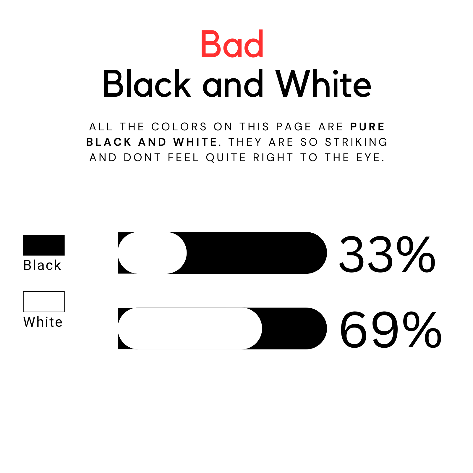
Bad Black and White
Pure black and white can be too harsh and may create a jarring effect, detracting from the overall design.
 Click image to view gallery
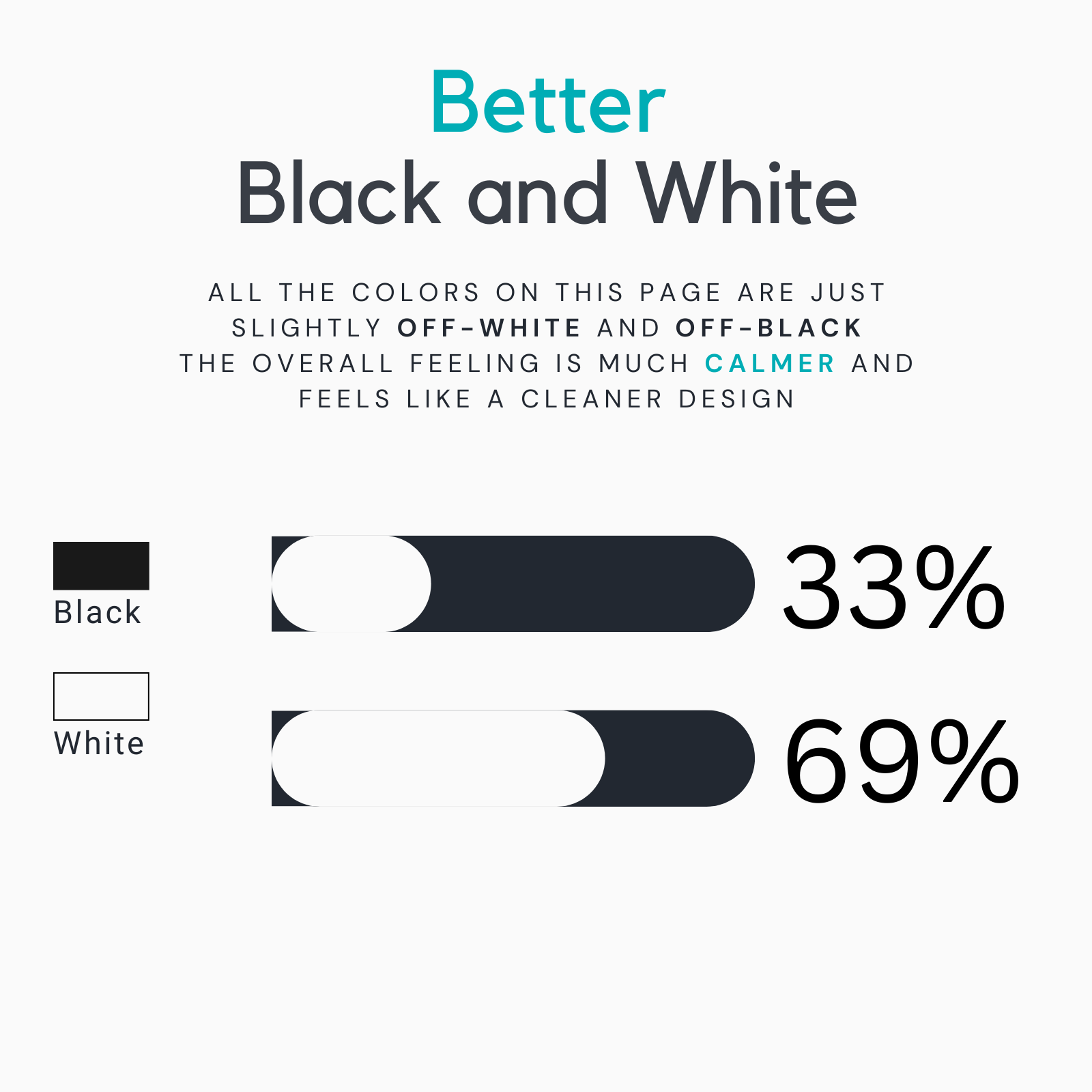
Better Black and White
Instead, use off-white and off-black shades to create a softer, more aesthetically pleasing look. This approach can make your design feel more balanced and visually appealing.
Choosing the Right Color Schemes
 Click image to view gallery
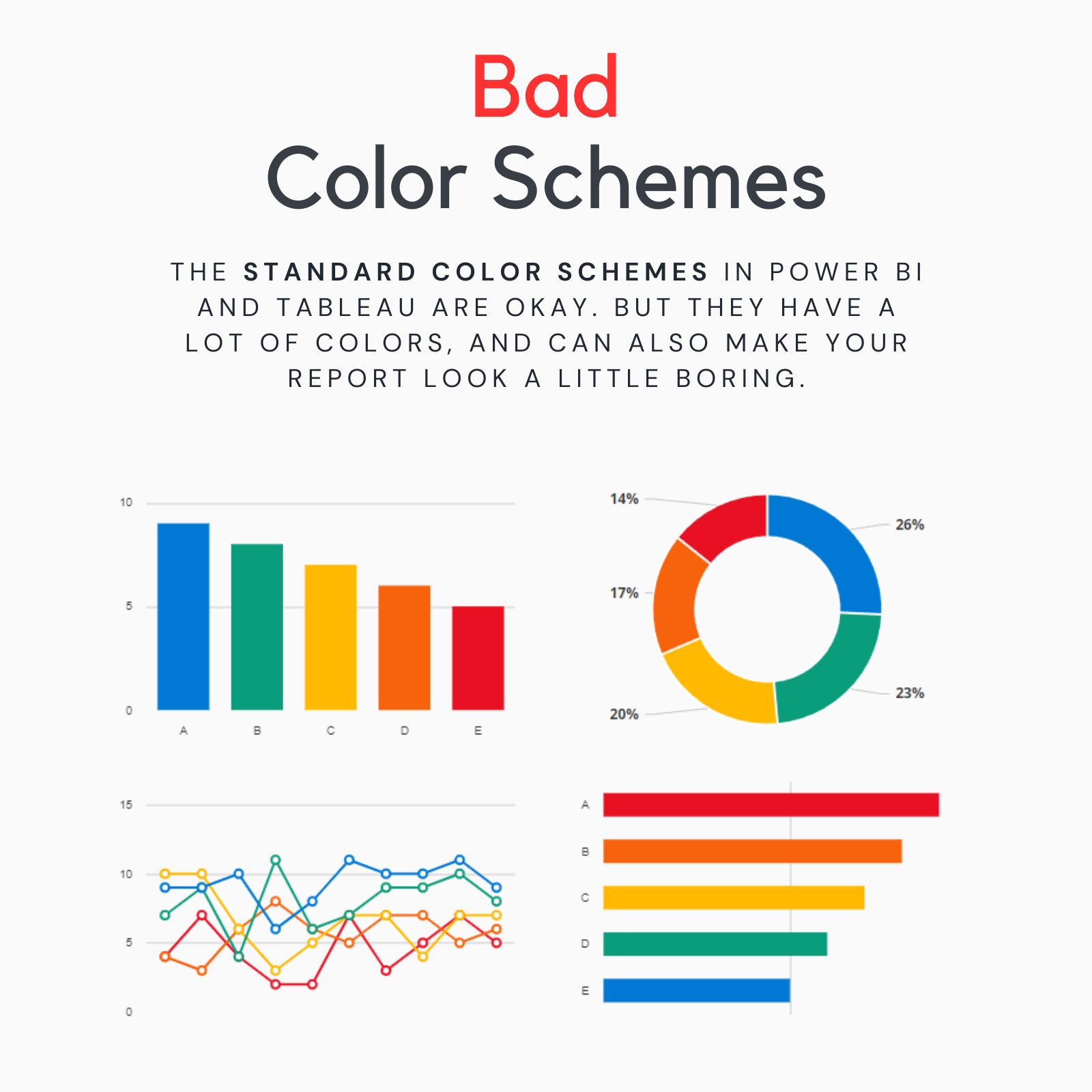
Bad Color Schemes
Default color schemes in tools like Power BI and Tableau can sometimes be overwhelming due to the sheer number of colors they use. This can make your report look busy and less engaging.
 Click image to view gallery
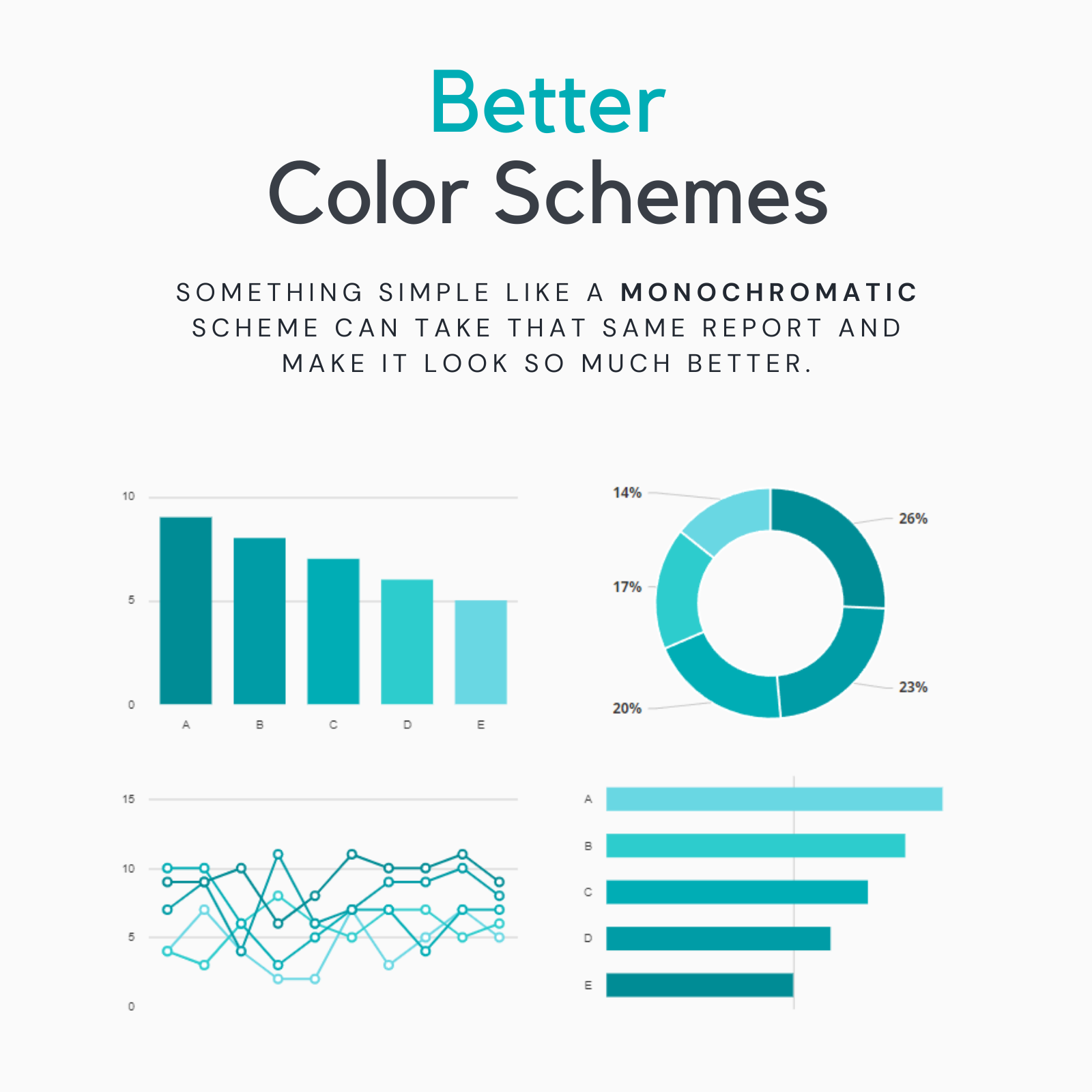
Better Color Schemes
Consider using a monochromatic scheme or a limited color palette to create a cleaner and more visually appealing design.
Keep Your Audience in Mind
Always consider your audience when choosing colors. The goal is to make your message as clear as possible and ensure that your report is both engaging and easy to understand.