Previous Data Projects

Customer Purchase Analysis
Sales Trends

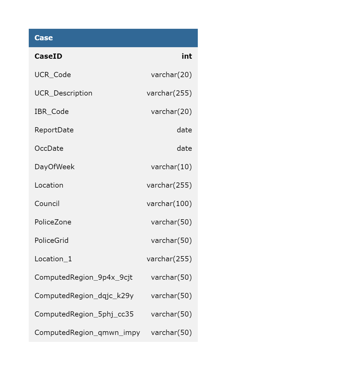
SLC Police Cases 2010-2014
Crime Insights

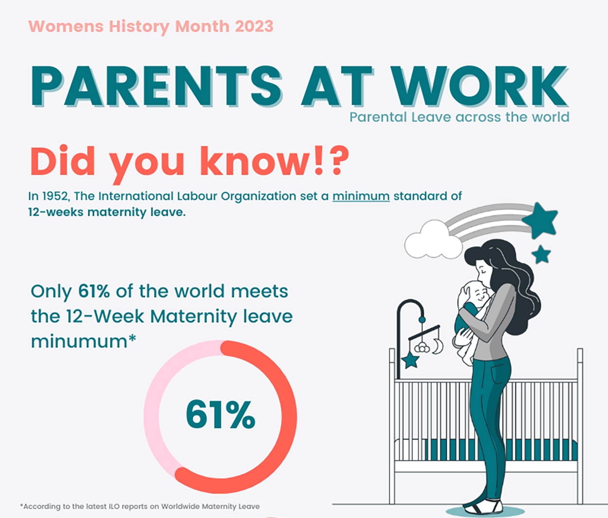
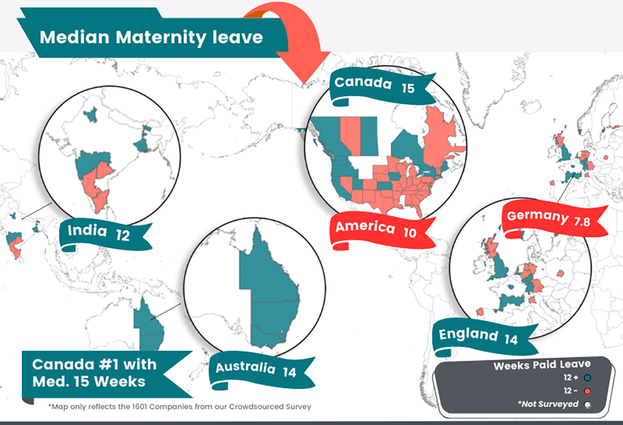
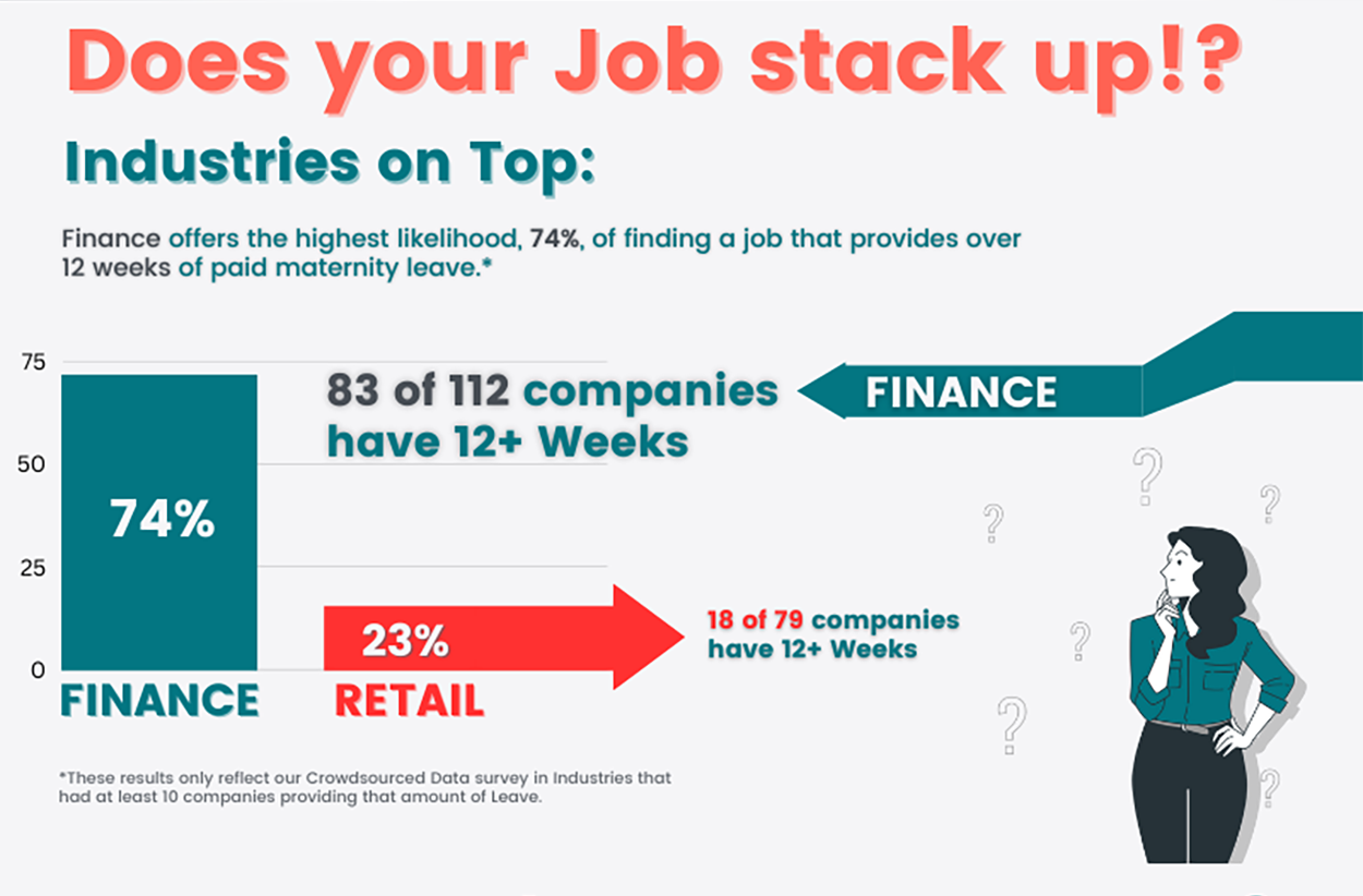
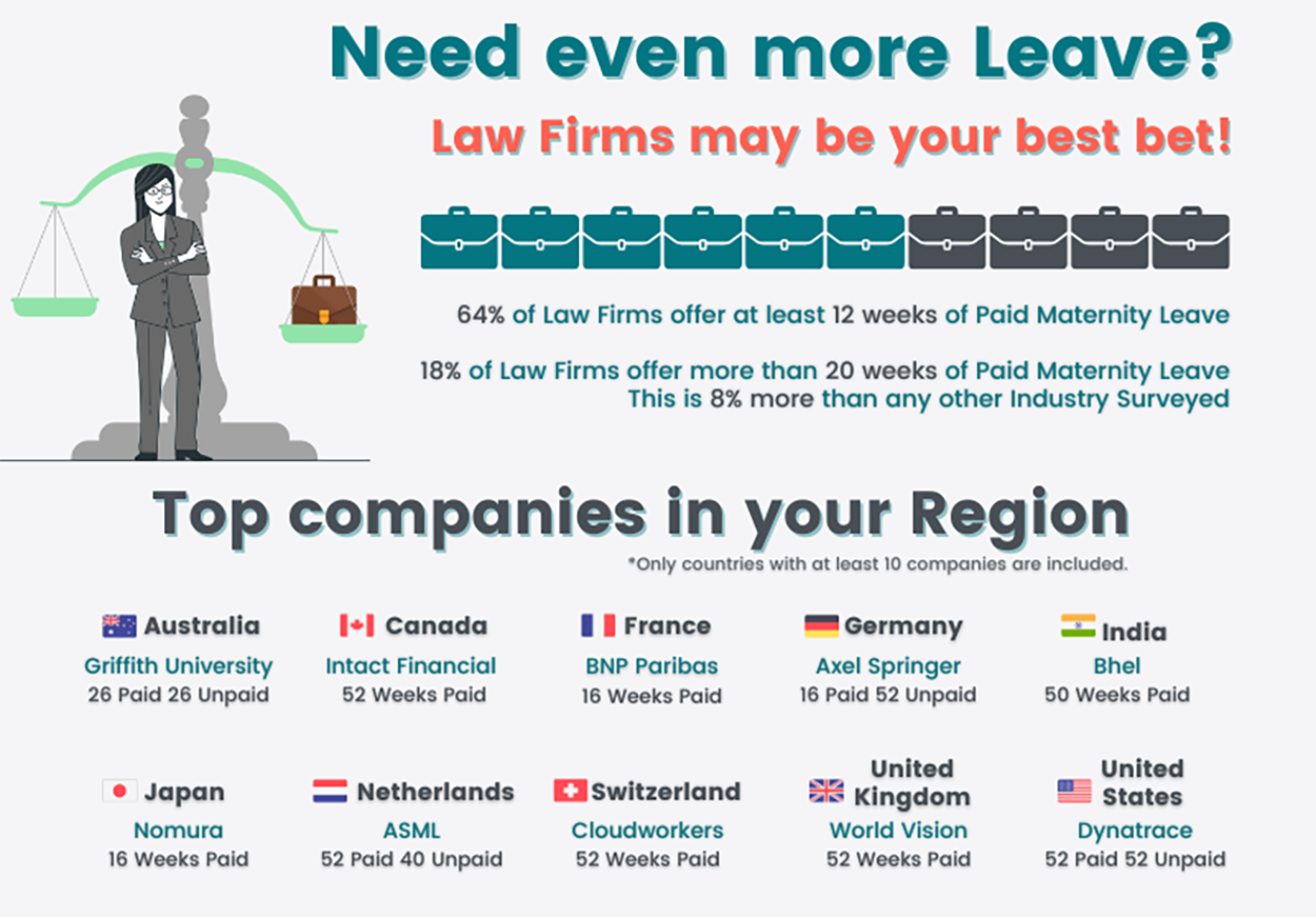
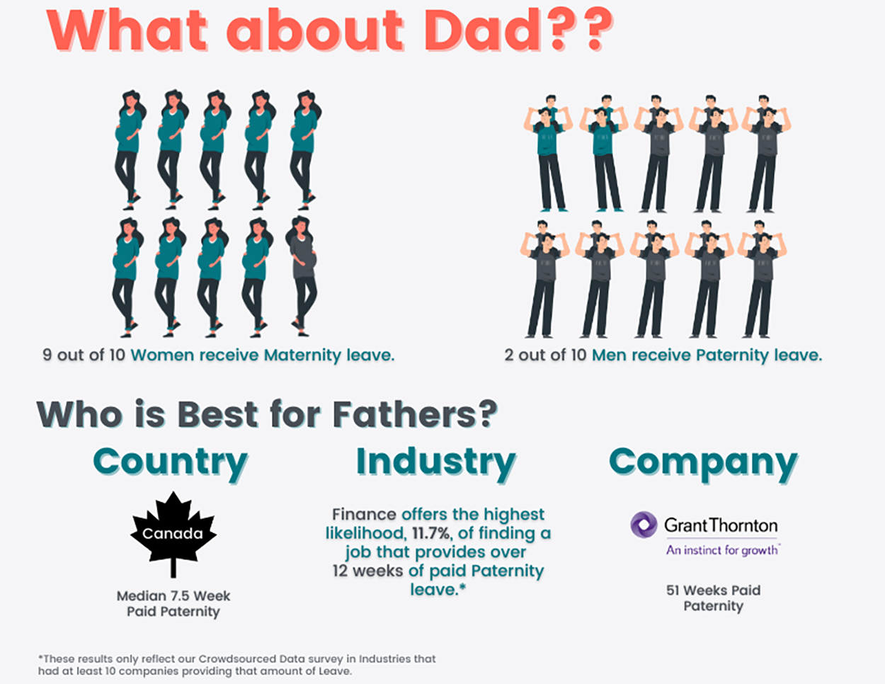
Parental Leave
Infographic
More on my Github
Latest Videos
Recent content from my YouTube channel
HOW TO create your own data for data analysis
Take your portfolio projects to the next level by crafting the PERFECT, instead of settling for data that's already been analyzed by EVERYONE!
Twitter Interview Question - Bucket Counts
Lets learn how to separate users into BUCKETS. This is a useful technique that you will definitely need to know as a data analyst.
Advanced SQL JOINs Tutorial
Lets learn how to use multiple JOINs in SQL and how to use multiple CTEs in SQL to solve this Advanced JOINs problem from HackerRank.
Subscribe to my YouTube Channel
About
I love tinkering, building cool apps, and solving both simple and complex problems.
-
2022
2022
Career Transition to Data Analysis
I began my career transition from retail to data analysis in December 2022. Since then, I have gained hands-on experience in cleaning and analyzing data using SQL, Excel, and Python. I've developed expertise in crafting visualizations with Power BI, Tableau, and Looker, building a solid foundation in data analysis and reporting.
-
2023
2023 - 2024
Focused Study and Certifications
During this period, I dedicated myself to advancing my knowledge in data technologies and acquiring several key certifications.
-
Harvard University
- Computer Science - CS50 (Aug 2024)
-
University of Michigan
- Retrieving, Processing, and Visualizing Data with Python (Aug 2024)
- Python for Everybody (Mar 2023)
-
Coursera
- Google Data Analytics Professional Certificate (Feb 2023)
-
LinkedIn Learning
- Advanced Microsoft Power BI (Feb 2023)
- Advanced SQL for Data Scientists (Feb 2023)
- View all my Certifications
-
Harvard University
-
2024
2024 - 2025
Data Exploration and Software Development
My journey has led me to discover a passion for exploring data with Python and coding late into the night. I love building web apps, tackling both simple and complex problems, and continuously learning and growing my knowledge in computer science.
-
2025
2025 - 2026
Pursuing B.S. in Software Engineering
In early 2025, I began pursuing my B.S. in Software Engineering from Western Governors University. Building on my existing data skills I am diving deeper into software development, algorithms, and system architecture. I'm excited to continue expanding my knowledge and work on more complex projects as I develop my skills!
-
2026
2026 - 2030
IT Developer - State of Utah
In 2026, I began working as an IT Developer for the State of Utah. My role has expanded to include automation development, building APIs, and maintaining and improving existing applications and workflows.